I was tasked with rethinking and redesigning the Marketo Default Program Calendar. I worked with a dedicated dev team, product manager and my own design team to come up with new mental models and concepts to make this feature more appealing than it was in the past.
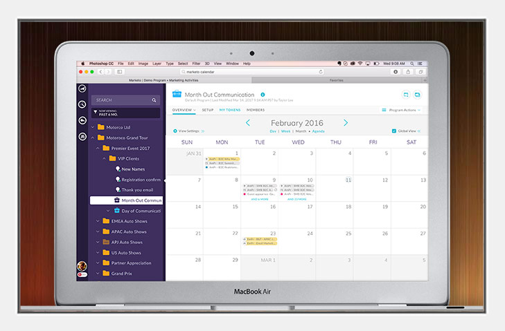
An overview of the Default Program Calendar
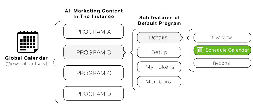
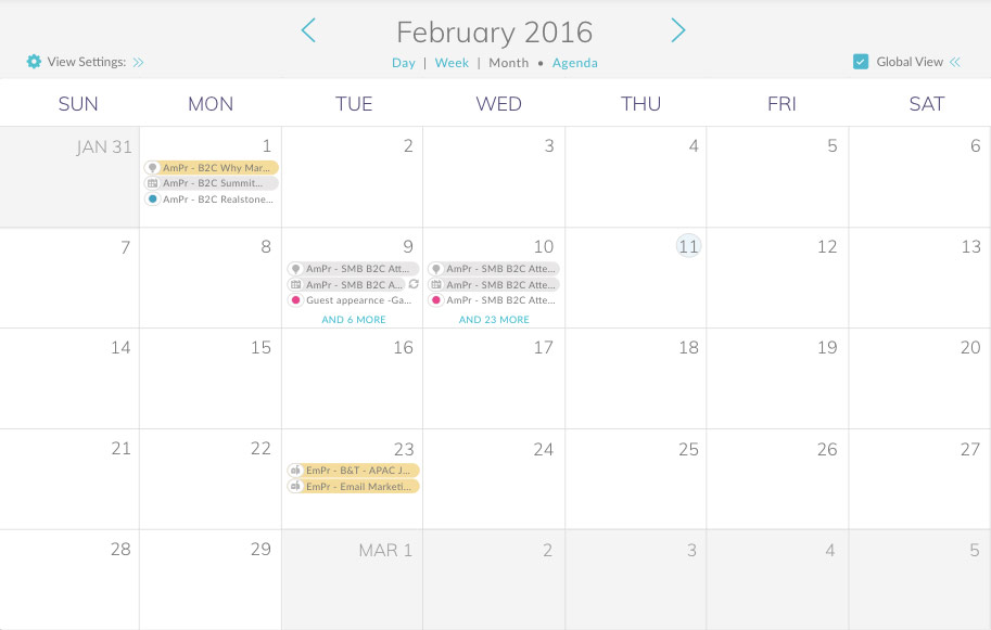
The default program represents a single marketing initiative. You can think of it as a container with all the stuff that you need to make the program work - these are called local assets and include landing pages, email, smart campaigns (automation), and more. In each Default Program lives a Scheduling Calendar. It shows you when all of your pertinent calendared events take place.
The problems
From The Business Perspective
- Low adoption
- Users don't know it exists
- Solution imperative from stakeholders due to past investments
- Internal and external confusion between the global calendar and the default program calendar
- Poor perception from customers of the feature
From The UI/UX Perspective
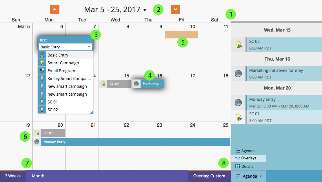
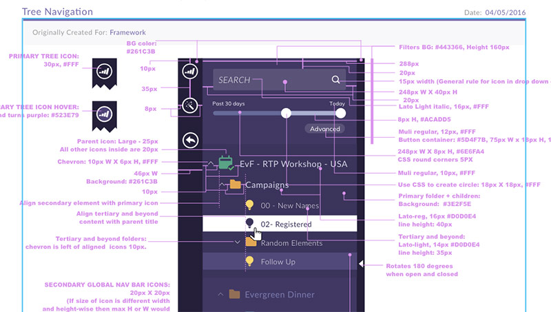
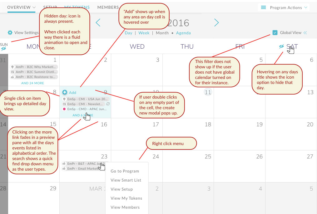
The numbers pertain to the marked up image below:
- A big conceptual issue was that a mistake was made to blend an agenda view and a month view together which kills horizontal space and becomes confusing to users
- The month arrows point up and down, which makes no sense for a standard calendar and the arrow next to the date opens a date picker
- The inline creation process forces a name before a type and then one can't distinguish what some of the types mean... Single click to create is jarring
- Marketo asset names are typically long, which don't fit in a small area
- Global calendar overlays have no distinguishing characteristics
- All entry types need to be able to be distinguished better
- User research determined that marketing professionals were not using a 3 week view at all
- Global views, a complex theory, are made even more complex with a buried and non-intuitive UI
First Steps
This was a very open ended project at the onset with no product manager attached to it. It was up to me to do some initial research and conceptualize some possible solutions while the organization freed up one of it's product managers. Before I started down the user research route I wanted to learn the internal history of this feature. I discussed it with anyone who had laid hands on it from the director of UX, developers, PM's, to the VP of product. After which, I was able to have a high level idea about where the calendar stood within the organization.
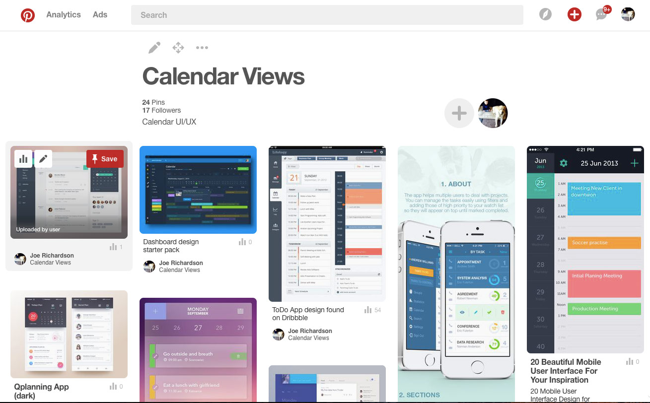
During that time I was doing a lot of research on calendering systems and especially marketing calenders. I started doing research all over the web and collecting my findings on Pintrist. Here is a screen shot from my board:
User Testing
We had been working on reorganizing the UX department for a while and instituting new processes. One of them was user research. We had a new system in place and it was wonderful to be able to test it out with this project. Our findings backed up what most OS us already knew, but we ran into a new major issue:
- Marketers don't typically plan their work on a calendar
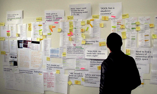
Many of the users we talked to liked to take a more holistic group approach, which looks something like the image below. It could be in a binder, or presented in other ways, but onset planning with a calendar just wasn't popular.
The calendar was being used for some of our larger enterprise clients for pure tracking of activity, so it was out of the question to disrupt it at this time. Also, there was too much other work happening with a complete redesign. After we presented our findings we came up with a direction.
The Strategy
Fix the UI/UX for the Default Program Calendar, which we would parody with the Global Calendar in a future sprint. In the next sprint after that conceive a true marketing planner that overlays onto the existing calendar.
After we had taken care of the direction we had to address another issue:
Designing with a new UI system in parallel
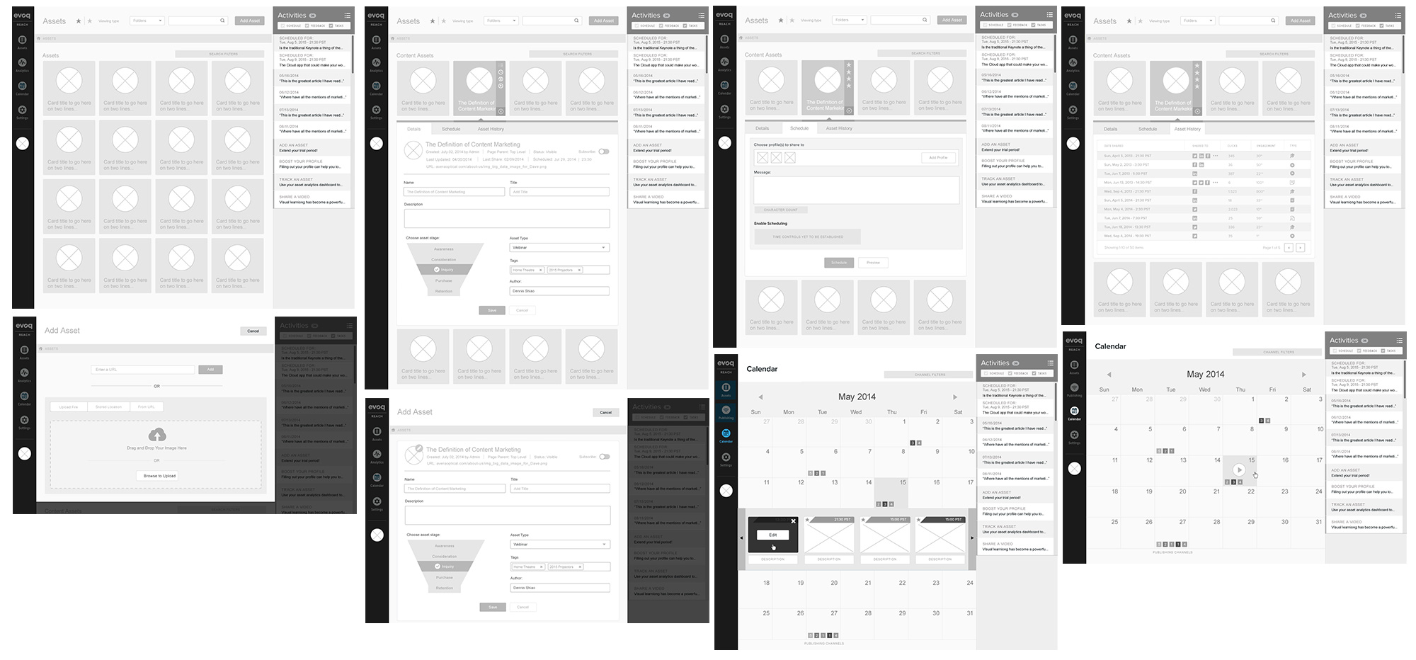
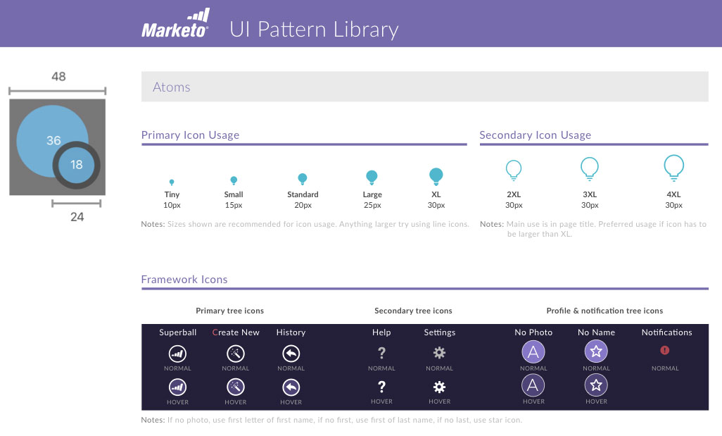
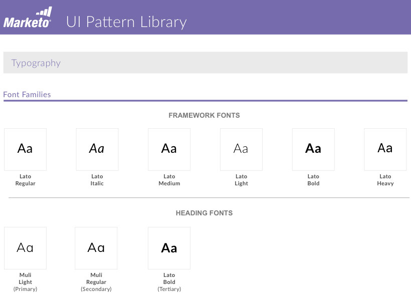
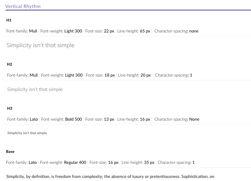
At the same time as I was designing this, our team was re-architecting the UI, creating a whole new design system and also a pattern library. We decided to forgo wireframes for this project so we could focus on fine tuning the UI and architecture. I knew this was going to be tedious, but it paid off in the long run, defining many of the styles and patterns that we would use later.
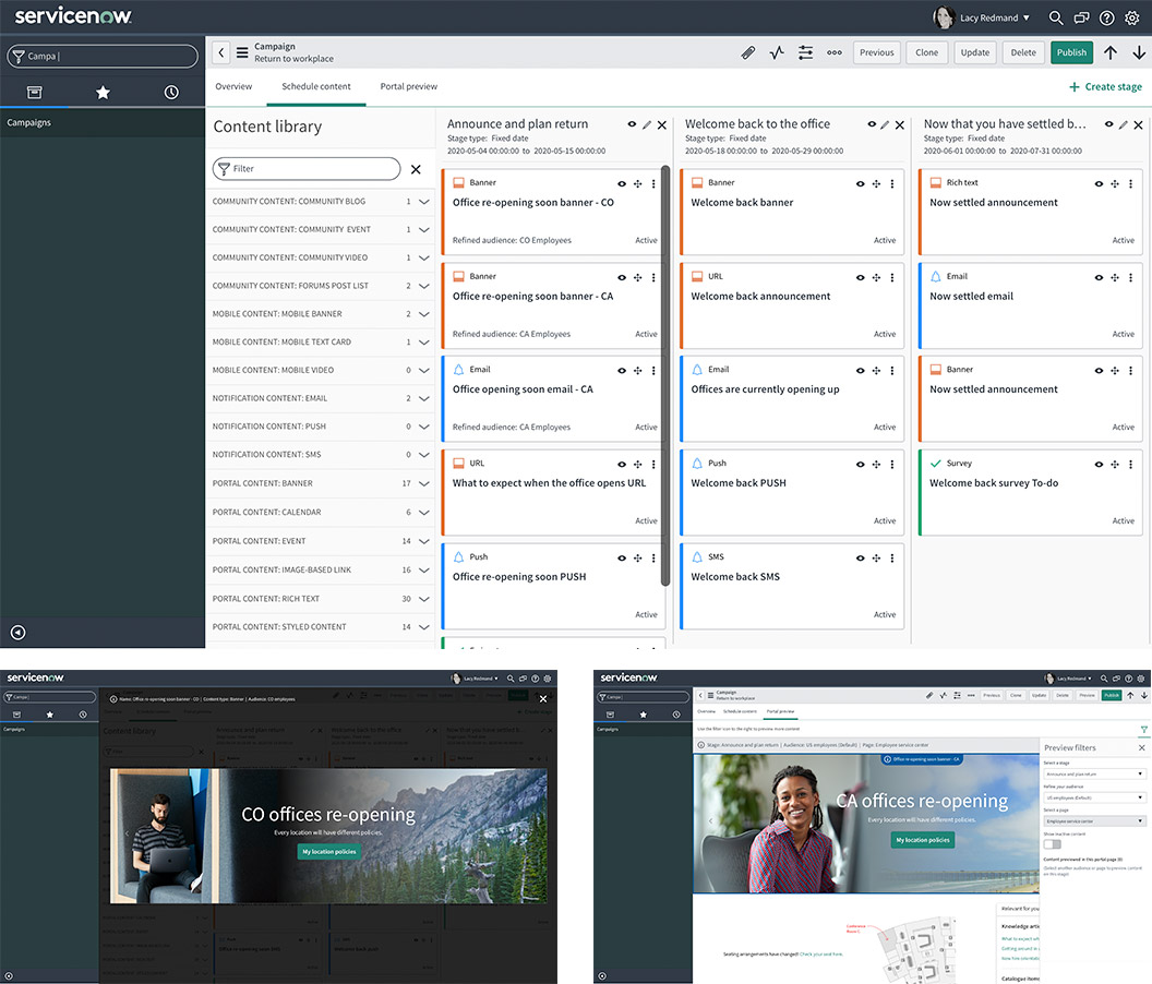
Final Designs
We went though many variations, sprints and changes. Here is a look at the final UI polish and UX fixes.
How we addressed the issues
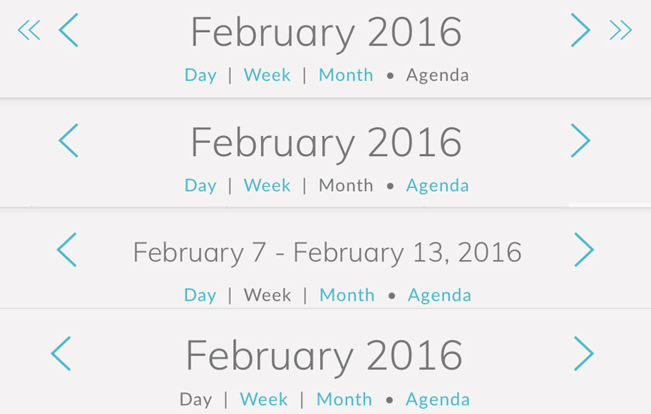
1) Separate the agenda view and the month view into independent view, also adding day, week and modal
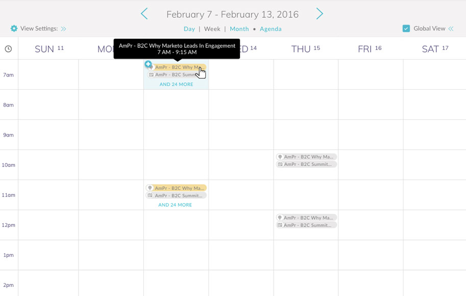
The design outcome was to create a new day view and all time agenda views, which are more typical to calendars. We also created a week view and a modal view that let users stay in context when working in week or month view. The view selection is prominent; Directly under the header date.
We also decided to remove the three week view as it wasn't being used.
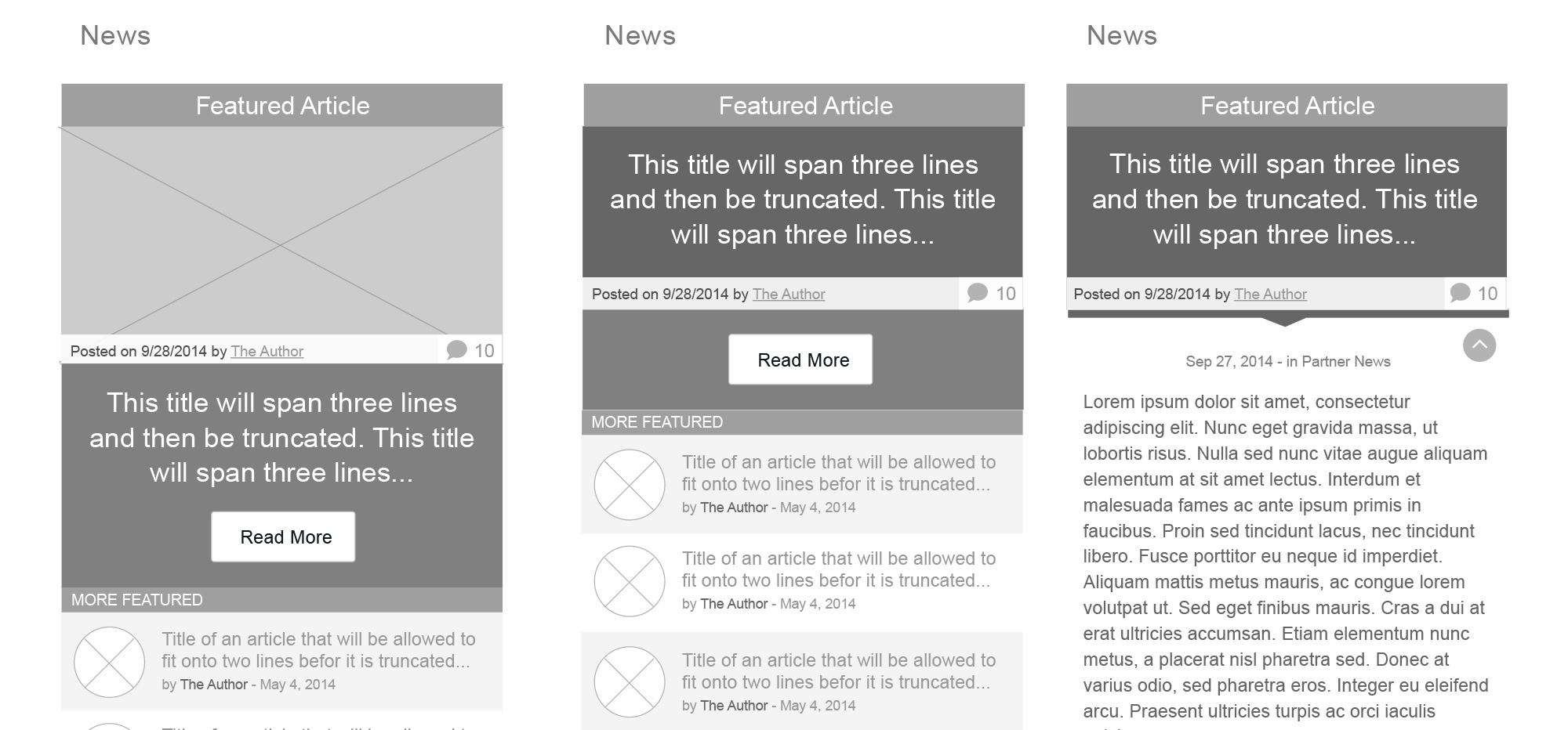
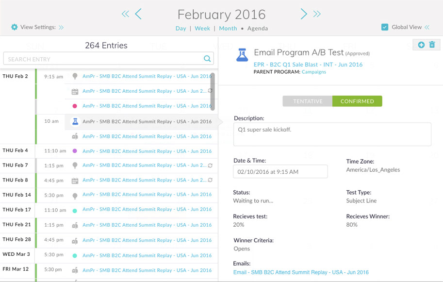
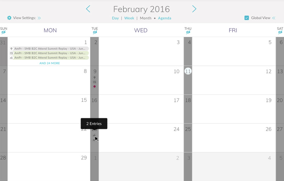
Agenda View (Day view similar, but no day label in left column)
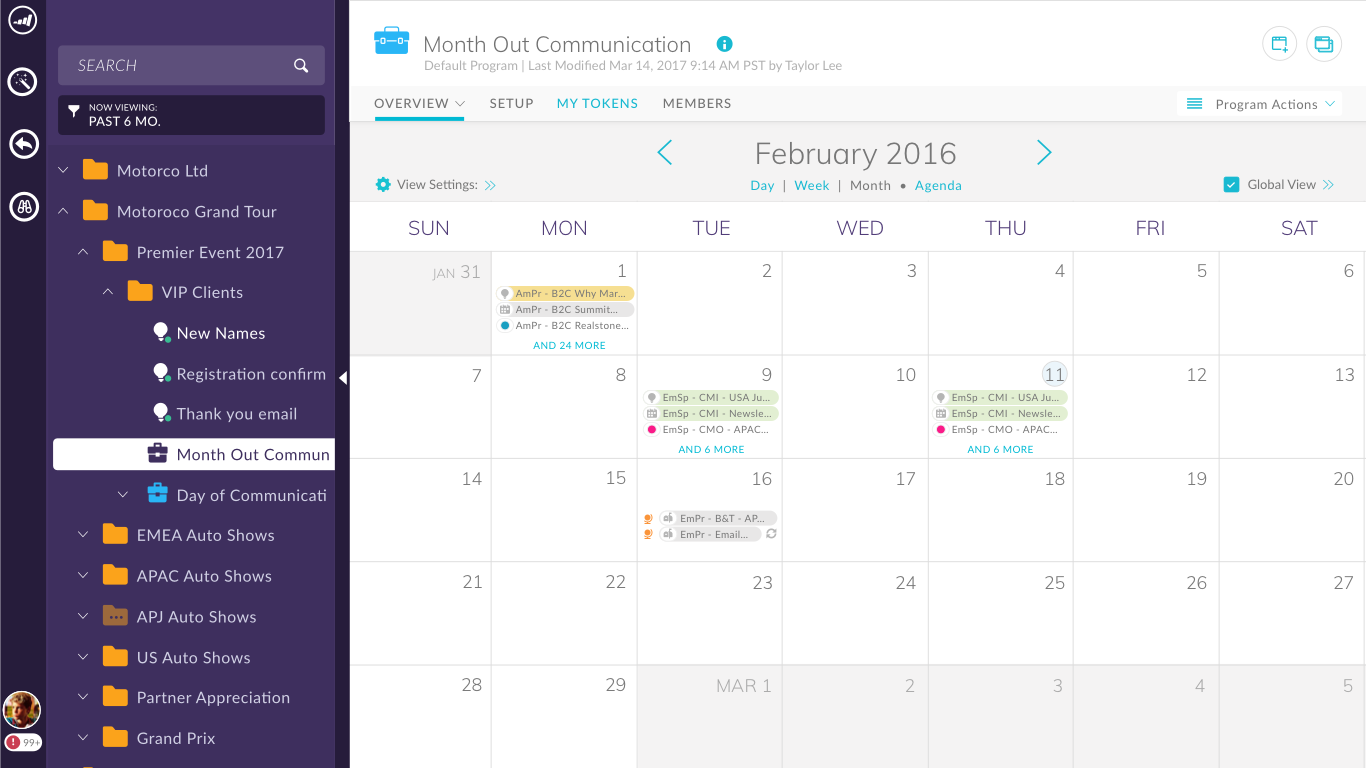
Month View
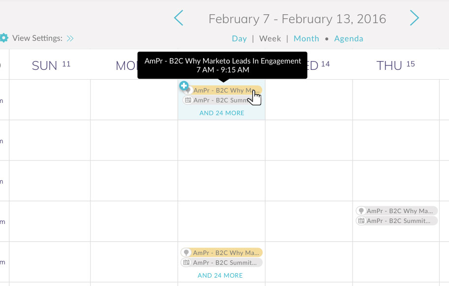
Week View
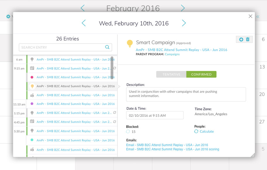
Modal View
2) Fixing issues in the top level navigation
Having a date picker was essentially having a calendar in a calendar, which made little sense. Also, the up and down arrows were confusing users. We simplified the interactions and made them appropriate to each view.
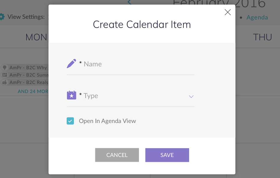
3) Rethinking the creation process
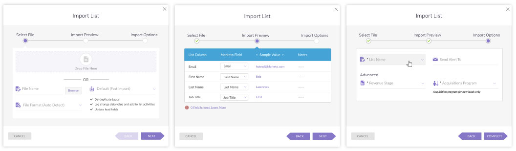
After user testing we determined that the creation process within the calendar itself was almost never used. Typically a user would create by duplicating from a template within the program and they would automatically populate in the calendar. The last attempt was to robust of an operation in an inline list, so we decided to move all creation into a modal, so that we could simplify the information for the users. We also let the user decide if they want to edit the entry further, or stay in context to where they were.
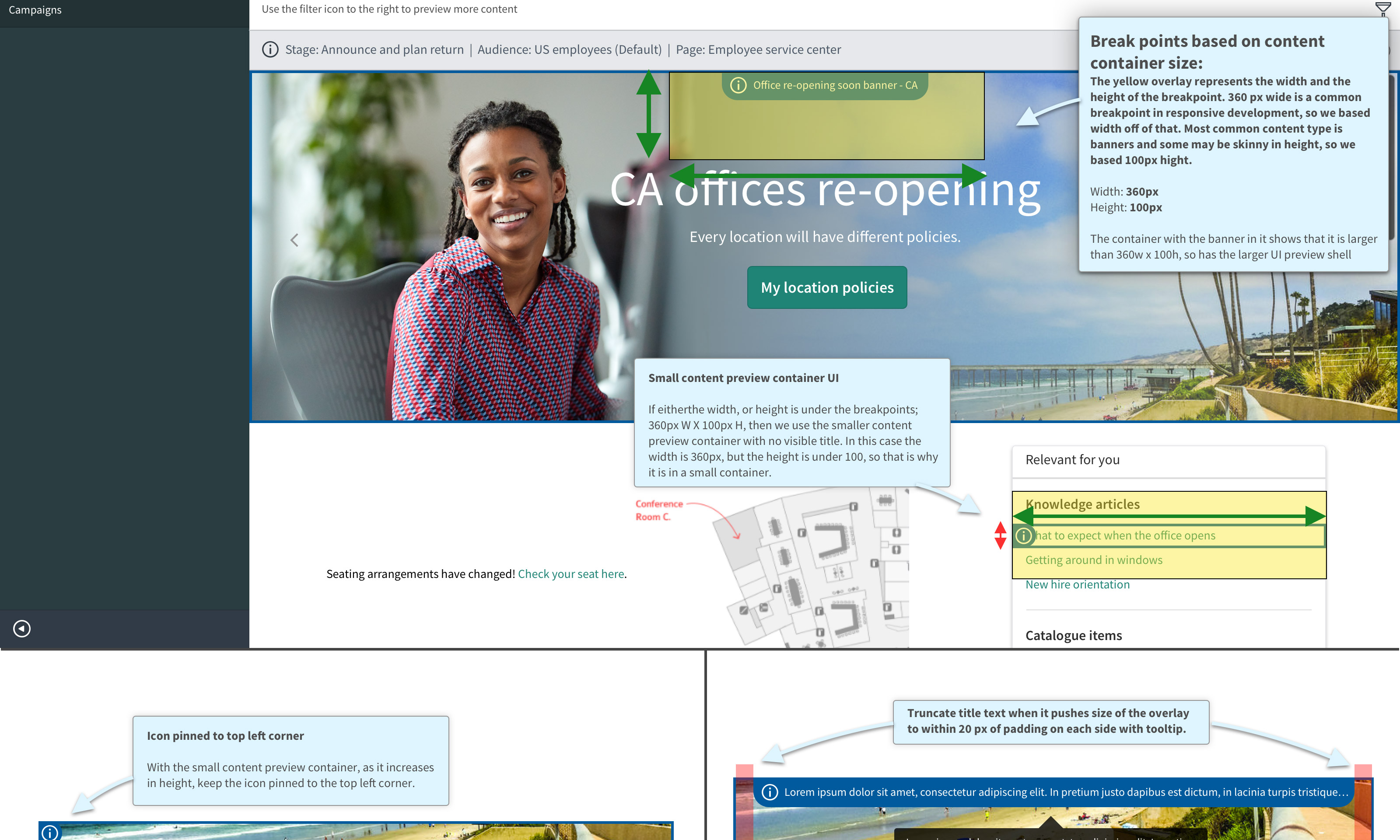
4) Solving the issue of long names in a small container
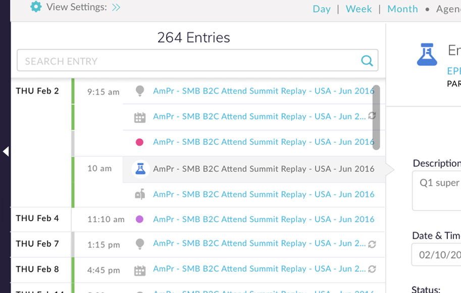
After much brainstorming and design exercises, we came up with multiple solutions for this issue. The best solution for this is the agenda view. The names are clear and can be read completely. The user can also drag the column over to the right to afford even more space if needed. Another creative solution we came up with was to hide certain days and collapse the navigation tree, which affords more horizontal space in the week and month views. Lastly if a name is hovered over on week or day then the user will see a tool tip with the full name and details.
Agenda view
Hidden days in month and week views for more horizontal space
Tool tips in week and month view
5) Simplifying the filtering process and visualization.
The first thing we did was move the filter controls to the top of the UI for prominence.
Previously, the user used the same panel to filter global views with entry types, which was an extremely confusing mental model, so we split up the filter by asset type and global filters into two panels.
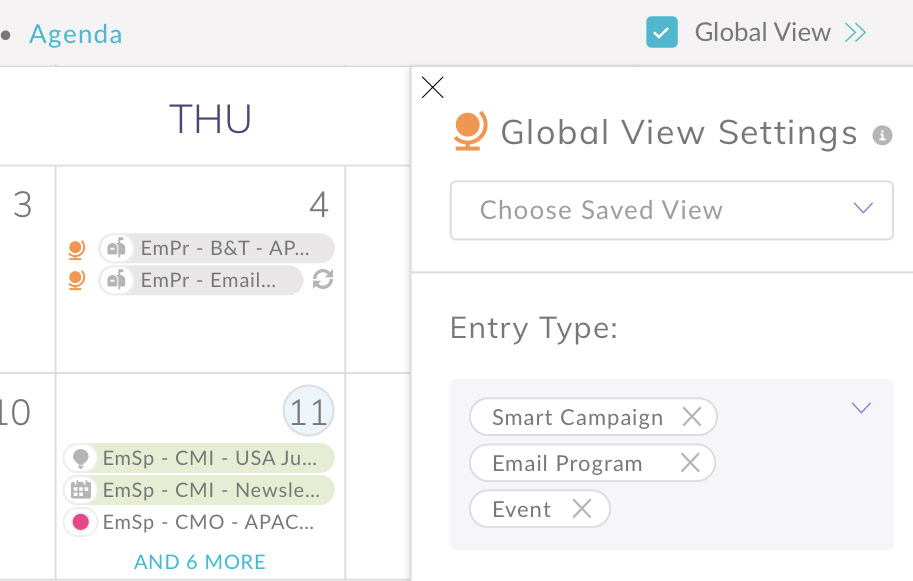
The default is to only displayed local entries to that program. If a user wants to filter in entries from the global calendar, then The global calendar filters are used to display entries from the users whole app instance. By inserting a global icon in front of the entry the user can now quickly identify a global entry.
View filter panels
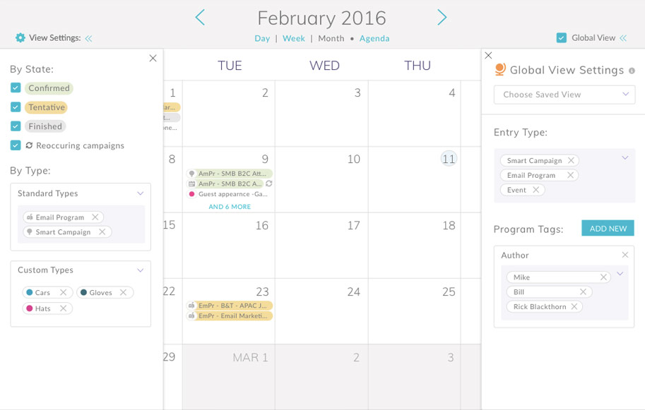
Global calendar asset visualized with globe icon

6) Give the user the proper visual guidance as to what the icons and colors stand for.
We needed to visualize what all of the icons and colors meant. We didn't have enough room in the UI to create a good legend system, so we decided to bundle it into the viewing by type panel. We also made sure to add the icon in the global filters panel label so that the users would associate it when viewing it in the calendar.
Colors and icons explained at a glance
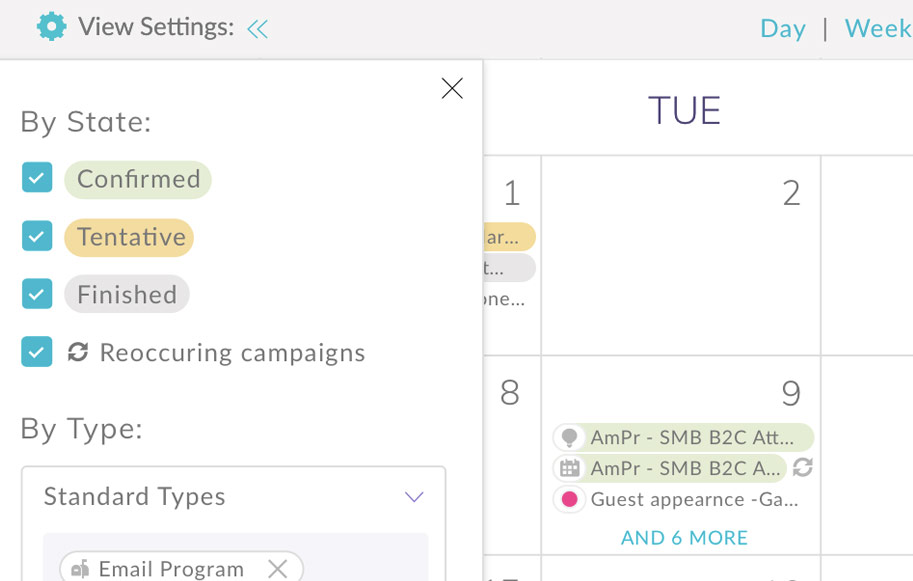
Global calendar icon explained at a glance
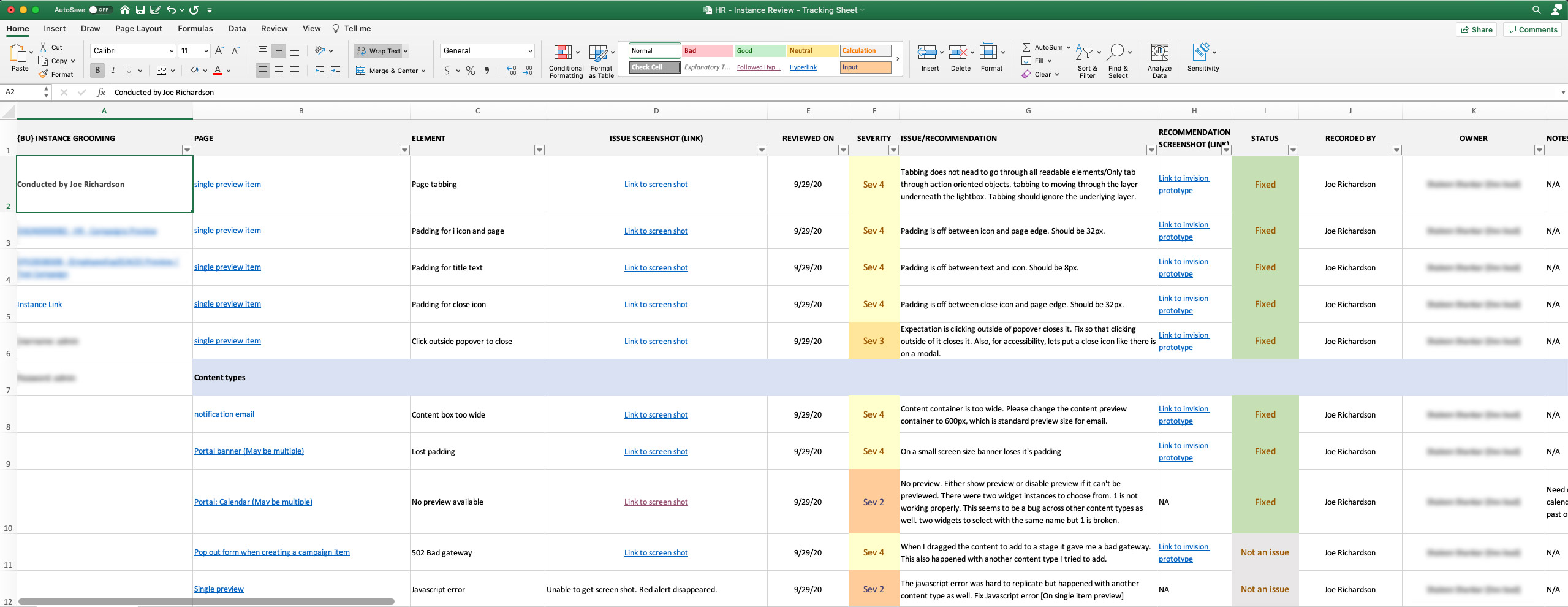
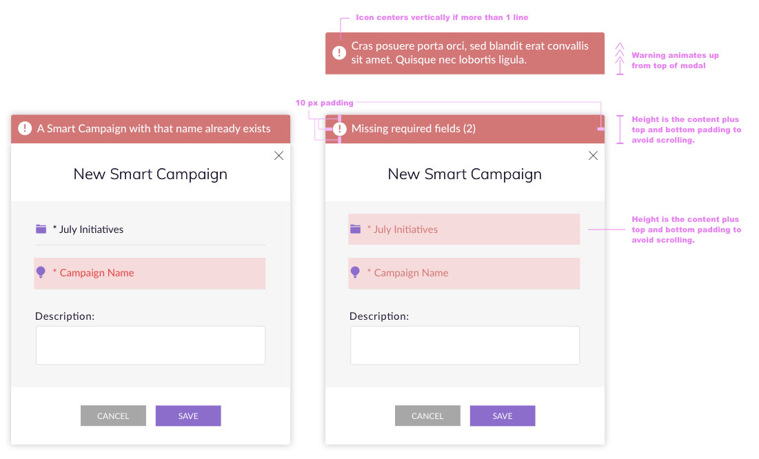
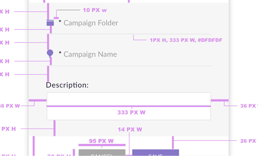
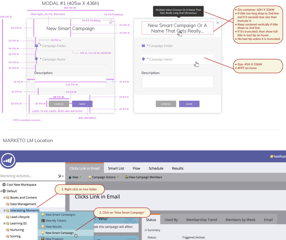
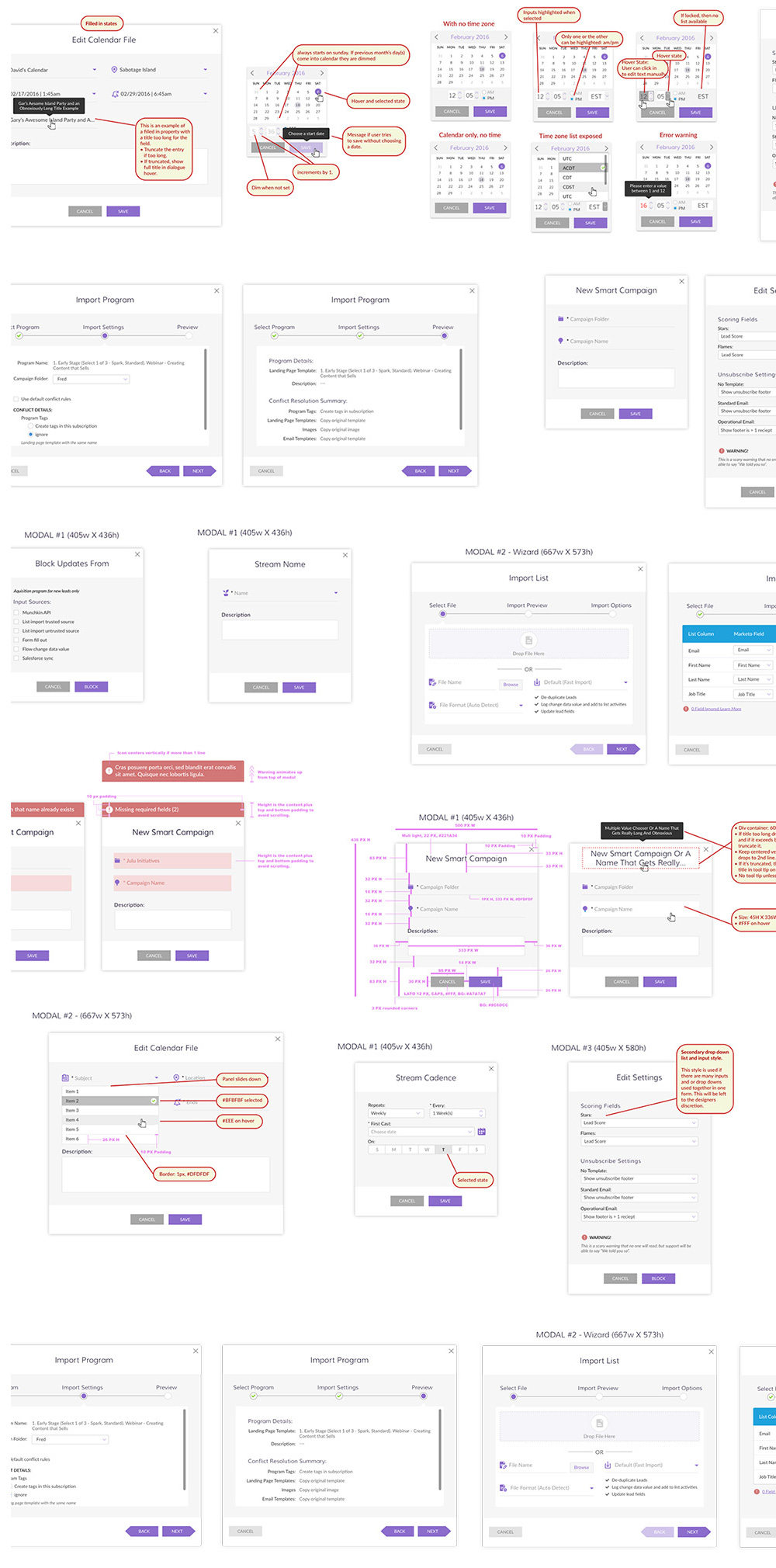
Delivery to dev
The process of delivery to dev is to mark up the design with thoughtful direction and red lines thatdictate styles, padding, sizes, etc. To coincide with this, any new animations and interactions that have been designed are animated with Principle and output to Gif, then uploaded to InVision where dev, design and product management can converse about them. Lastly, all sprints are run through JIRA to keep track of all activity.
Annotations for developers and PM
Starting point animations for devs
User testing validation
We tested the new designs with the same user pool to be able to validate the new designs. We received overwhelmingly positive feedback with the new changes and went forward into development and QA.

